


Taking in Susanne Stephenson’s retrospective, TRANSFIGUREMENT, now on exhibit at Pewabic, a newcomer to her art might be challenged to determine the starting point — her entire body of work is THAT good. A closer look reveals Stephenson’s evolution from fine, somewhat delicate porcelain pieces to an ingrained earthiness in more expansive terra cotta forces of nature: A progression from subtle and functional at the start to a crescendo of explosive and sculptural, with colors deeply woven throughout her story.
In Pewabic’s galleries through May 13, TRANSFIGUREMENT details Stephenson’s more than half century as a working artist. Pewabic hosts a gallery talk with Stephenson at 1 p.m., Sunday, April 22, followed by a pop-up of her smaller pieces and what she dubs “super-functional” work until 3:30 p.m. in the tile showroom.
Stephenson began teaching at Eastern Michigan University in 1963, shortly after receiving her M.F.A. from Cranbrook Academy of Art. One of her students was Tom Phardel, who now chairs the ceramics department at the College for Creative Studies and curated TRANSFIGUREMENT.
“I’ve known Susie’s work forever. All of it catches my eye,” says Phardel warmly. “I’ve grown up with the work so there were pieces of various time periods that needed to be in the show, no question about it. She is prolific, consistently doing new work of super high quality and work influential to younger people who may not even know it. Often students are too distanced from those who laid the groundwork for everybody else.”

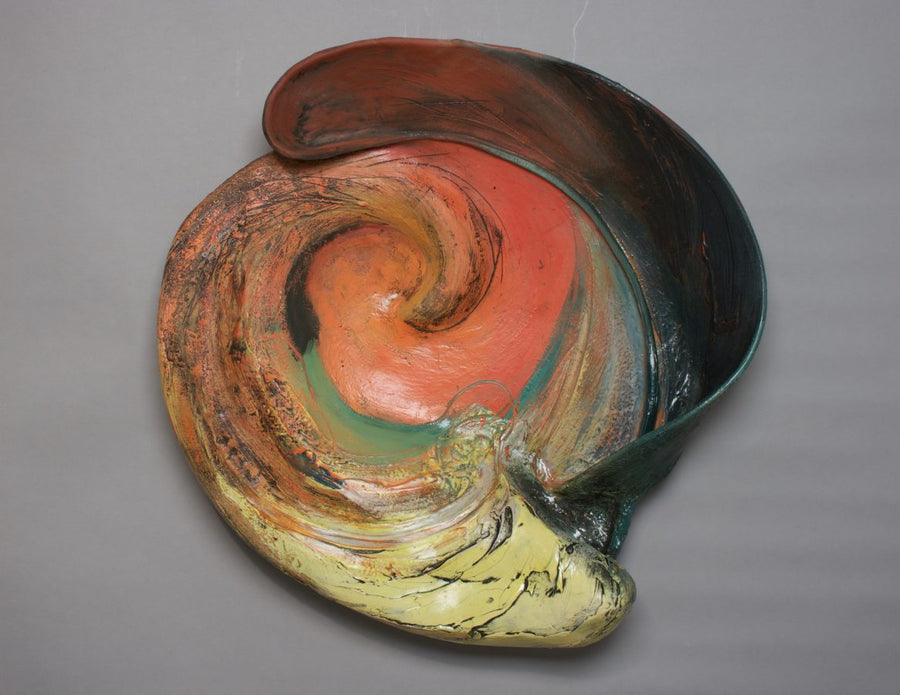
In TRANSFIGUREMENT, visitors find early functional pieces, including BRONZE LUSTER TROJAN SOUP TUREEN, 1976, porcelain, a result of a juried contemporary exhibition organized by the Campbell Collection that traveled to Cranbrook Art Museum. Stephenson gradually opted for more abstract work, like ORANGE WAVE, 1996, and TURQUOISE CREVASSE, 2005, both terra cotta. Viewers sometimes suggest visible forms or figures in her abstract pieces, though Stephenson resists swaying viewers in any particular direction.
“People want to say ‘what do you see?’ in those things. I don’t want to be too specific,” she says. “I think viewers should be able to look at one thing for a while and see something else later.”
Stephenson gravitated to terra cotta in part because she appreciated the malleability it afforded her.
“The porcelain for me wasn’t as forgiving as the terra cotta,” explains Stephenson. With terra cotta: “You could cut from the bottom and slap on pieces easier without working too much with them.”
She found her initial style of drawing oil pastels onto clay similarly confining, finding it better to have values of color or sketches of form rather than being literal, she says. Stephenson’s work consistently demonstrates that command of color, and vibrant layers interacting with varying textures. The physical shape and dimensions of her pieces evolved with soft curves delineated through incisions and even occasional dismemberment, often growing into bigger, almost fortified pieces bearing deliberate traces of Stephenson’s touch. Her tiring of pieces having flat bottoms fueled her preference to work on several pieces at a time and in parts, perpetually adding and subtracting, she says. Her late husband John described her work as following a “tripod principal,” Stephenson explains.
“I’d tell my students sometimes you have to look at the pile of debris in case it’s more interesting,” explains Stephenson.
“Susie’s additive and many people are reductive,” explains Tom Phardel. “My perceived reputation is I’m pretty skillful with building things and I look at her plates and I have a clue, but not much of one. They’re part thrown and part hand built. Seeing the backs of them is as much of a story as the front.”
Ultimately Stephenson’s hands create the final finish, whether through application of elements and glazes or rubbing in a vitreous shine. In her most recent work, Stephenson embraces mixed media – as in SPACE GARDEN II, 2014, ceramic, wire and epoxy – and often celebrates nature and the otherwise overlooked and under-appreciated that is considered mundane, like a repaired pothole. She recounts stopping to shoot photos in a parking lot to capture the streaking tar lines for the basis for her ROAD DECAY series. She used tissue for tracings, and mixed coffee grounds in the slip to mimic the cold patch.
“I just think it demonstrates her thinking process of always looking for interesting material from which to extrapolate ideas,” says Phardel. If six decades in ceramics taught Stephenson something, it’s to find inspiration everywhere and to appreciate it.
“Nature isn’t always beautiful,” Stephenson says plainly. Still, her work consistently is.


